Project Overview
Client
Together Hospitality
Studio
Rare Ideas
Timeline
2026
Disciplines:
Brand Narrative
Brand Architecture
Naming
Visual Identity Design
Experience Graphics
Packaging Design
"When everybody zigs, zag." Marty Neumeier, Zag (2007)
Together Hospitality wanted to build a Pan-Asian restaurant, and two constraints were already on the table.
Internal: Three of the group's venues, Cobbler & Crew, Juju, and Elephant & Co., were already operating within a kilometre of the proposed site. A fourth, Gather, served a similar audience. The new venue could not compete with its own family.
Categorical: Pan-Asian was already one of the most saturated categories in urban Indian dining.
The instinct is to solve both constraints separately. Make it more distinct from the neighbours. Make it stand out in the category.
That approach kept hitting a wall. Every solution to one constraint worsened the other. The more distinct it became from nearby venues, the more conventional it read in the category. The more it stood out in the category, the more it resembled the neighbours.
Both pressures lived at the same level of the question. Nearby venues only compete with you if you are operating as a single concept. Pan-Asian saturation only matters if you are operating as a Pan-Asian restaurant.
We moved up a level.
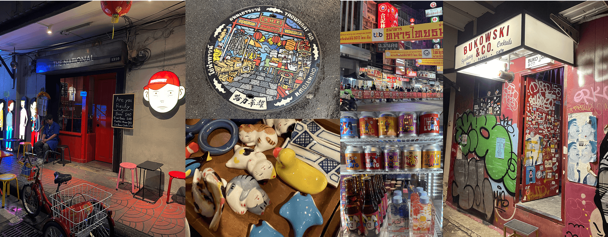
Izipizi stopped being a restaurant and became a Southeast Asian street.
Once we made that shift, the rest dissolved. A street is not a category. There was no other street in Kalyani Nagar to differentiate from. And none of the nearby Together Hospitality venues occupied the same emotional register.
The brief asked for a restaurant. The work returned something different.
A fictional street, not a country
There was a second observation to acknowledge. Asia is already hybrid. The most distinctive visual cultures in the region (Thailand, never colonised, more visually intact than almost any of its neighbours) are the ones that resisted assimilation. A unified Pan-Asian identity, designed in India and built in Pune, would have flattened that reality into a single voice the region never had.
A fictional street drawing from multiple traditions at once was the more honest answer. It was also the one that matched the audience's memory.
Before any visual decisions, we separated the region we were drawing from into its actual parts. Not by country or cuisine. By visual logic.
Zen Minimal Asia. Japan, Korea. Negative space as structure.
Pop Techno Asia. Urban Korea, Japan. Hyperactive, kawaii-inflected.
The Heritage World. China, Thailand, Cambodia, Vietnam. Ceremonial language. The default of most Oriental restaurants. The one we left alone.
The Tropical World. Indonesia, Philippines, coastal Thailand. Saturated colour. Hand-painted signage. Imperfection as character.
Megacity Efficiency World. Singapore, Hong Kong, Tokyo transit. Cosmopolitan, functional, infrastructural.

Each is a behaviour, not a place. Each organises visual information differently, uses colour differently, accumulates character differently.
What dropped out as soon as the map existed: the visual world Asia gets reduced to in restaurants. Dragons. Lanterns. Cherry blossoms. Red and gold. Brushstroke fonts. A century of Western shorthand recycled into its own genre. None of it came back in.
"You feel as though you've entered a hybrid of Seoul's late-night snack culture, Bangkok's night markets, and Tokyo's alleyways."
Eleven identities, one street
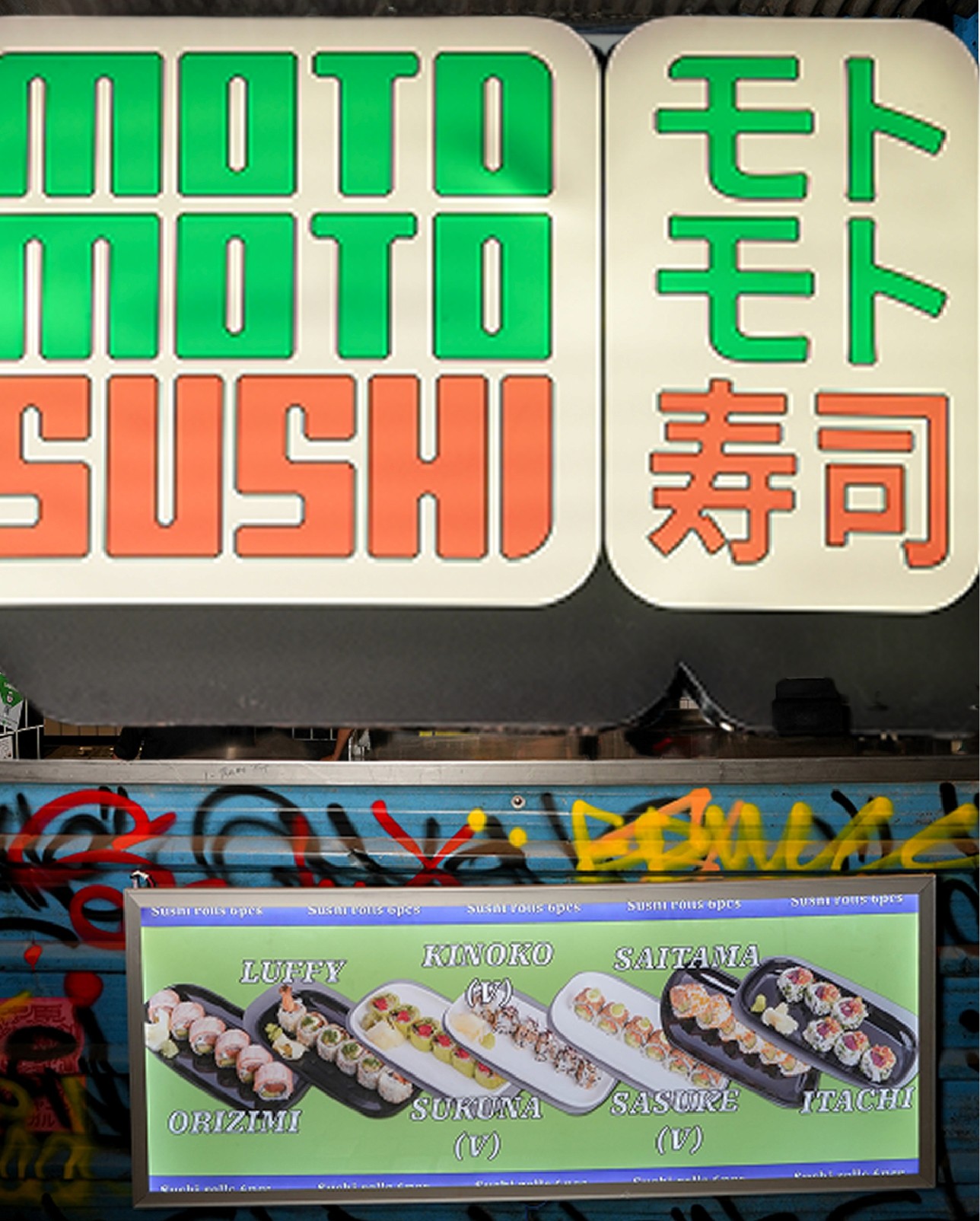
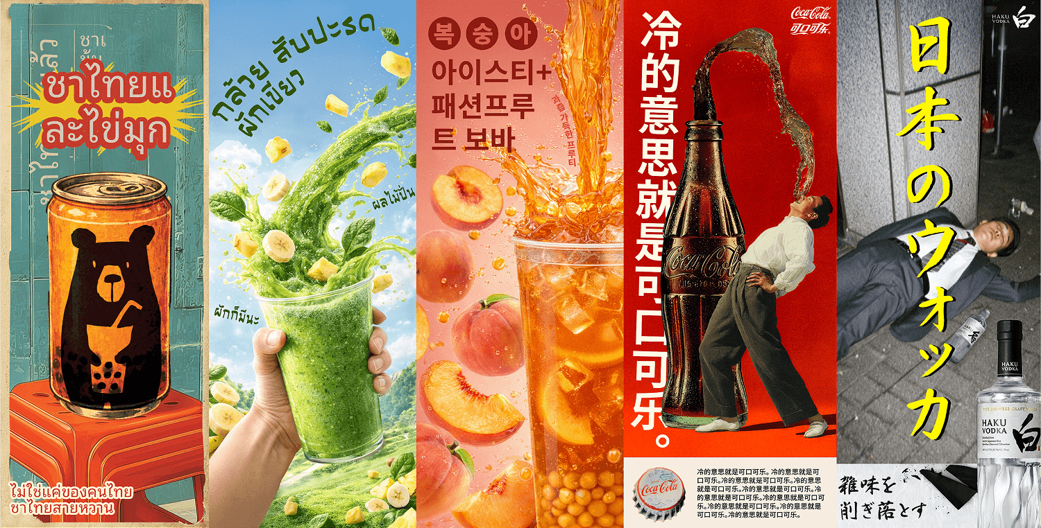
A street cannot have a unified identity. So we did not give it one. Izipizi became a parent brand holding eleven independent identities:

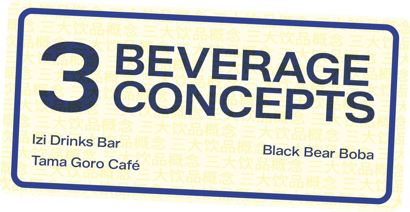

Each defined by what it sells. Each with its own logo, palette, and typographic register. Each operating as if it had arrived on the street independently of the others.
The beverage architecture is structured to follow the day.
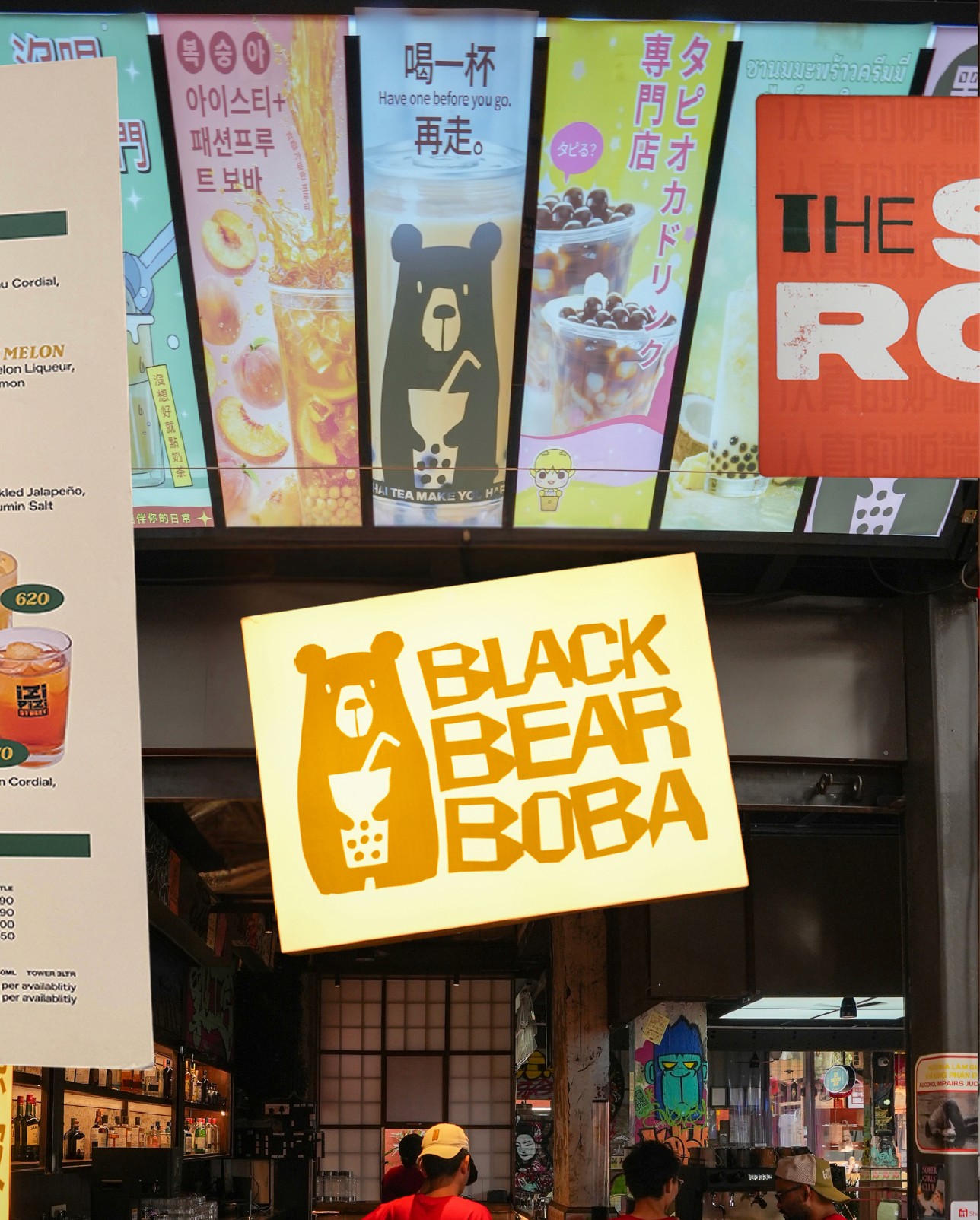
Tama Goro Café holds the daytime, teas and coffee and matcha and smoothies, the habitual end of the room.
Black Bear Boba is kinetic, textural, built for the table that wants something with bite to it.
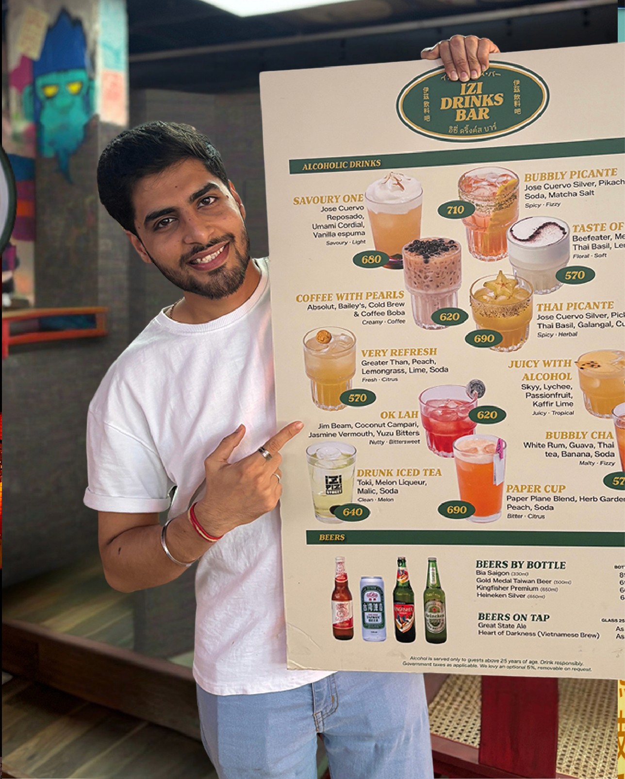
Izi Drinks Bar handles the evening, Asian highballs, sake, soju, signature cocktails designed by Arijit Bose.
Three rooms inside one bar, not one room pretending to be three.
The retail is structured the same way. Same Same Shop is the lifestyle side: quirky objects, stationery, street-inspired merchandise sourced through Korea, Japan, Thailand. Everyday Mart is the pantry side: sauces, snacks, packaged food from across Southeast Asia and India.
The logic for holding eleven voices together came from manga, manhwa, and the broader Asian graphic novel tradition. Multiple visual worlds can sit inside a shared grammar as long as the underlying rules hold.
At Izipizi, each identity is a panel. The grammar that unifies them, colour logic, typographic weight, and spatial density, is shared and controlled without being visible. What appears unbranded is not unconsidered. The identity lives in how the parts sit together, not in making them look alike.
"It felt like a street that had always existed, rather than something that had been designed."

Designed to feel undesigned
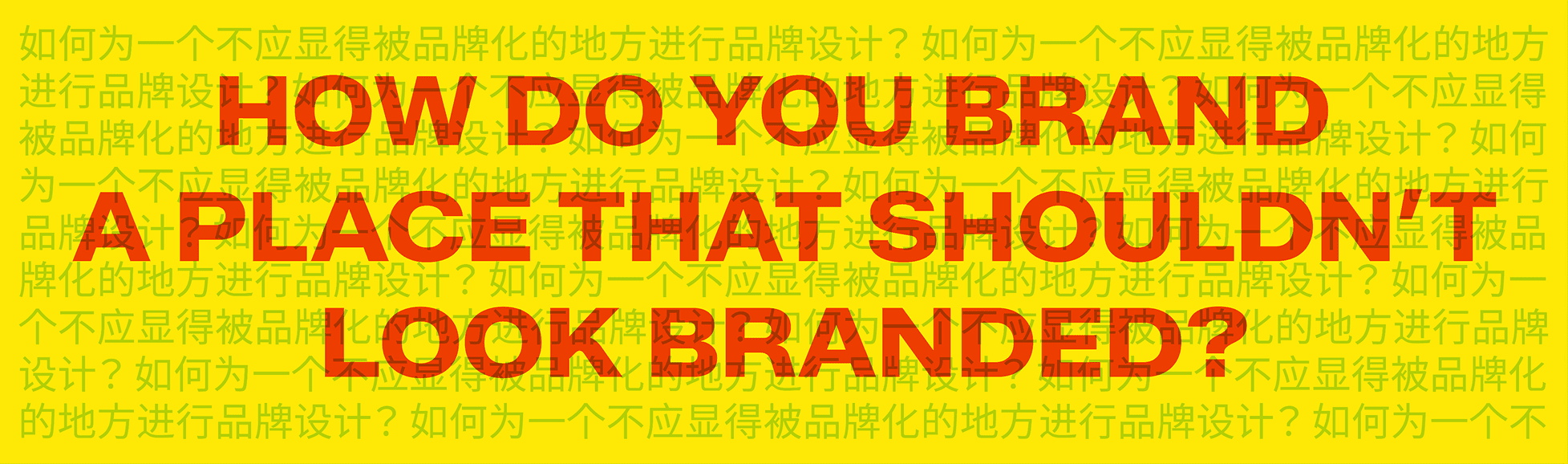
The hardest thing to design is a place that does not feel designed.
A real Southeast Asian street is dense and overwhelming, never hostile. Every stall communicates at full volume. The accumulated effect is more alive than any single element within it.
The five operating principles that hold the work together are written into the brand playbook, and they are the line every team member reads first.
Easy. Decisions feel light because the labour is hidden. A guest walks in, finds a stall,
sits, eats, leaves.
Plural. More than one of everything, on purpose. Eleven identities, five colours, four scripts, three beverage programmes. The plurality is the brand.
Lived-in. The look of a place that has accumulated, not been designed. The sticker wall changes. The condiment trolley is dented. The menu has a typo on purpose.
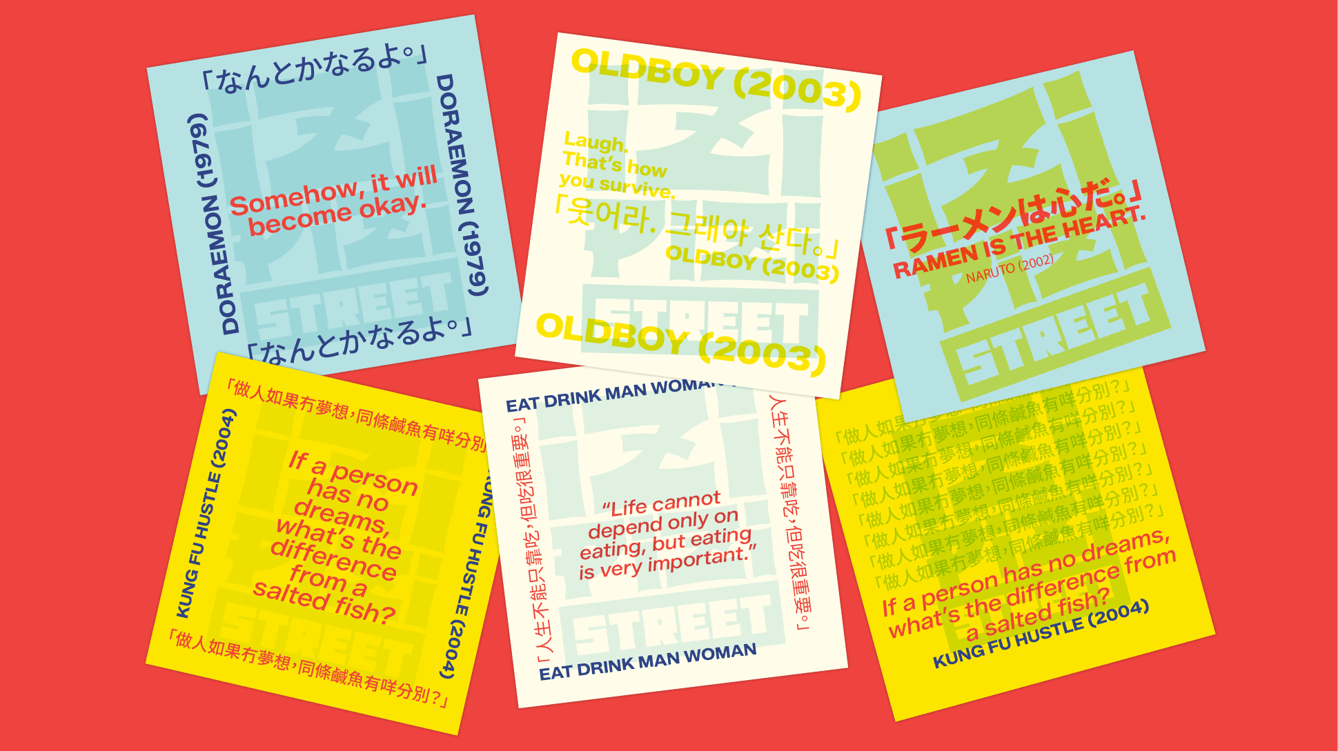
Plugged in. Fluency in what is happening right now. The brand watches what young people in Seoul, Bangkok, Tokyo, Penang, and Hanoi are listening to and watching.
Carefree. The comfort to leave a typo in. To name a drink Very Refresh and keep the broken English on purpose.


The principles applied to language as much as visuals. A hawker on a street is not hiring a branding studio. They name things based on instinct, what feels right in the moment, or a translation that came out slightly broken.
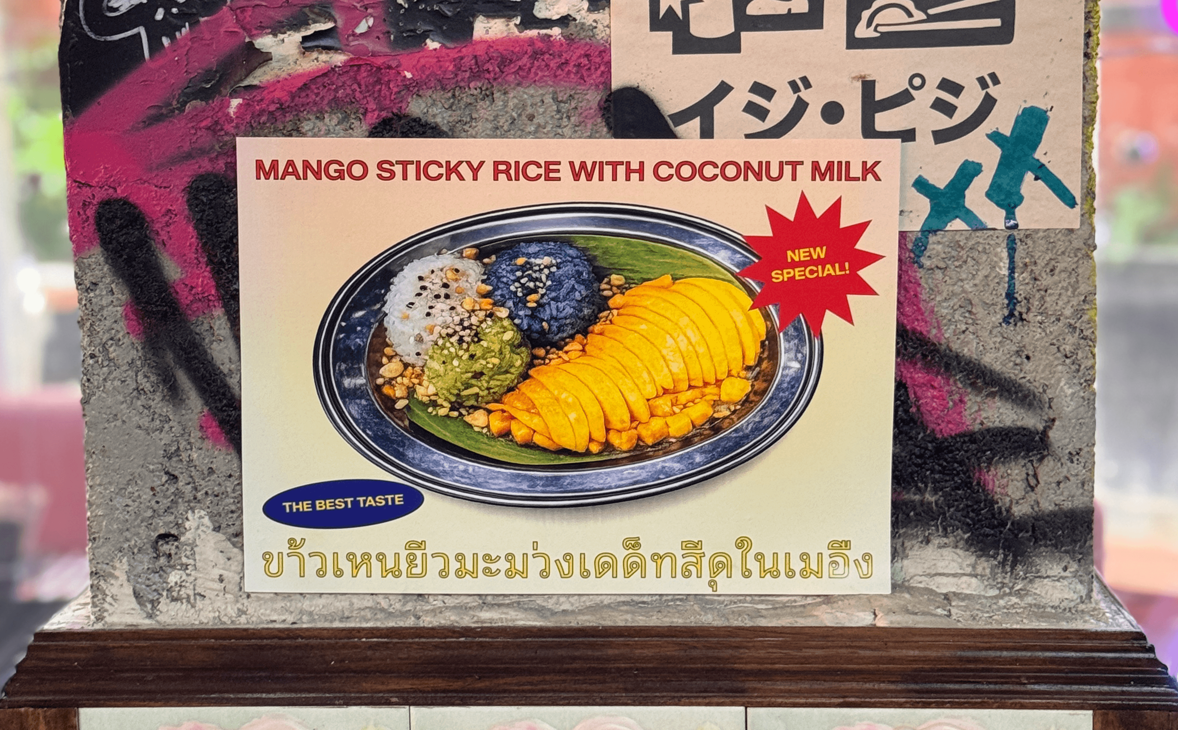
Drink names became Ok Lah, Thai Picante, Paper Cup. Conversational. Direct. Anti-romantic.
Coasters carry literal translations of Southeast Asian phrases that become accidentally funny in English. Not comedy at the cultures' expense. An observation about how these streets actually communicate.
Even the name followed the same logic. Izipizi, drawn from easy peasy, softened, made unfamiliar, made placeable in a city we had not visited. It belongs to no cuisine and no country.
We put a lot of thought into making sure it does not feel like thought has been put into it.
The visual system
Logo. English names, drawn in the typographic sensibility of their cultural origin. Readable to anyone. Unmistakably somewhere.
The Izipizi mark borrows from the grammar of Asian public signage. Modular letterforms, architectural stacking, and a subtle curvature in the Z and P that references the structural logic of Asian scripts. Red on sky blue. Applied as street signage, not presented as a brand.
Palette. Risograph. A historically cheap print medium with high-saturation, slightly imprecise colour behaviour. Five colours: red, yellow, blue, cyan, black. The default for Southeast Asian restaurant branding is to lean heavily on red. We did the opposite.

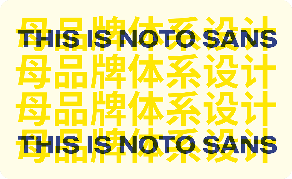
Typography. Zalando Sans Semi Expanded paired with Noto Sans across Simplified Chinese, Japanese, Thai, and Korean. The palette draws from something old. The typeface sits closer to how Southeast Asia communicates today..

The hawkers. Eleven identities. Eleven design briefs. The rule was differentiation, not coherence. No two neighbouring stalls share a palette.
The premise: these are hawkers who could not afford to hire a designer. That quality makes the environment feel real rather than produced.
"Every element within the space has been custom-designed to create an environment that feels discovered rather than designed."

The bar. Forty-four bar counter panels. Each derived from the country of origin and visual era of the spirit it represents.
The same drink, drawn in five different hands across five different places and times. Side by side, visually incompatible. Together, exactly what a bar on a real street would look like.
We paid attention to each guest touchpoint, designing in the details
The decisions that build a place's character are usually the small ones.
Menus are nearly three feet tall, referencing Thai restaurants where menus work as street posters. Image-led. On one page, a faded mirror image of the artwork sits behind the print, mimicking cheap paper and ink bleed. Entirely deliberate.
Black Bear Boba cups are branded as Black Bear Boba, not Izipizi Street. A stall that has operated long enough has its own packaging. For a guest holding a cup, it feels like a real place with its own identity, not a system.
The space is layered with half-torn stickers, graffiti, and torn posters. To ensure they felt genuinely accumulated, multiple people were brought in to make them. The space should feel like anyone could have added to it.
The condiment trolley, designed by Chef Hanoze Shroff, lets the palate travel mid-meal in the way it would on a real hawker street. Two types of furikake, two house sauces, and a slow-braise glaze. The only piece of culinary theatre in the space, earning its placement because the food next to it does not need theatre.
At 9:30pm the lights dim. The music shifts to 2000s hip-hop, the soundtrack people heard on the streets of Bangkok and Seoul. The room opens up.
Karan Khilnani, who led the operational design with the Together team, treated this transition as the moment the format had to prove itself.


Brand defines behaviour. Space responds.
A brand can articulate behaviour. Space has to translate it.
Working with Keith Menon and the Spiro Spero team, the project ran as a continuous loop between identity and architecture. Brand defined how each identity should behave. Louder, calmer, more deliberate, more accidental. Space responded. Signage to stalls. Stalls to flow. Flow to surface.
"We were designing for memory above all. The goal was to create a spatial experience that feels instantly familiar to anyone who has spent time on the streets of Southeast Asia."
Keith Menon, Co-founder, Spiro Spero
The collaboration was unusually direct. Rare Ideas is led by Vijeta Singh, who is also a partner at Together Hospitality. The project was approached from inside the venture rather than outside it, allowing decisions to compound across identity, architecture, and service.
Karan Khilnani led the operational thinking and unlearning, because building a street-format restaurant inside an Indian hospitality culture meant stripping away inherited reflexes around service language and front-of-house formality.
Chef Hanoze Shroff built the culinary architecture across hawkers, deciding which dishes belonged to a stall and which belonged to the shared kitchen. Arijit Bose built the beverage program. Viresh Mangrule runs the bar. Karan Kulkarni held the venture together as the third Together Hospitality founder.
A brand identity is what they say it is.
The clearest measure of whether the methodology worked is whether the intent travels. It did.
Discovered, not designed : "feels discovered rather than designed" (Elle Gourmet)
Gathered, not themed : "built to feel gathered rather than themed" (Curly Tales)
A street that pre-existed the brand : "a street that had always existed" (India Food Network)
Asia as hybrid, not as a country : "Seoul, Bangkok, Tokyo all at once" (Curly Tales)
Real without performing authenticity : "did remind us of those countries' streets" (Diner, District)
The brief asked for a Pan-Asian restaurant. The work returned a way of seeing categories as levels, behaviour as brief, plurality as honesty, and the small surfaces as the place where intent either lives or dies.
A place designed to feel undesigned demands more rigour, not less.


Featured On


Credits
Client
Together Hospitality
Karan Khilnani
Vijeta Singh
Karan Kulkarni
Hanoze Shroff (Partner Chef)
Studio
Strategy, Creative, Direction, Copy
Vijeta Singh (Rare Ideas)
Brand Identity
Omisha (Lead Identity Design)
Mahek (Brand and Spatial Design)
Architecture and Interiors
Keith Menon (Spiro Spero)
Beverage Program
