
Rare Ideas partnered with House of Croissants to build a hospitality brand around a single product category. In a market crowded with all-day cafés and long menus, we centered the croissant as the anchor of the experience, shaping HOC into a neighbourhood croissanterie defined by daily rituals, repeat behaviour, and instinctive recall.
Project Overview
Client
House of Croissants
Studio
Rare Ideas
Timeline
2025
Disciplines:
Research
Strategy
Communication
Visual Identity
Experience Design


Background & Context
House of Croissants began with lived experience rather than commercial replication.
The founder, Yesha, spent years travelling across cities, observing bakeries, cafés, and everyday food rituals. What stayed with her was not fine dining or novelty formats, but the quiet role neighbourhood bakeries play in daily life.
When she returned to Bandra, the ambition was clear.
Build a croissanterie where the croissant is central, not decorative
Create a place that locals return to daily, not occasionally
Draw from European baking culture while remaining grounded in Bandra
Turn a familiar product into a recognisable habit
The intent was strong. What was missing was strategic clarity around how to own a single product category in a crowded hospitality market.
Rare Ideas was brought in to define and operationalise that ownership.
Audience
Before defining the brand, we defined the behaviour.
The core House of Croissants guest:
Is well travelled and culturally aware
Lives and works within the neighbourhood
Has predictable café habits across the week
Values consistency, warmth, and familiarity
Looks for reliable quality rather than constant novelty
This audience does not explore menus extensively. They return to places that make one decision easy and repeatable.
That behaviour made category ownership both possible and necessary.
The Challenge
Bandra has no shortage of good café and croissants are everywhere.
They appear as supporting items on long menus.
They are treated as add-ons, not anchors.
They are rarely associated with a single place.
The problem was not product quality.
The problem was mental association.
House of Croissants did not want to serve good croissants among many things. It wanted to become the place people thought of when they wanted a croissant, without scanning options or comparing menus.

In hospitality, doing many things can feel safe.
But doing one thing well is what people remember.
Category ownership means becoming the default reference point for a specific product, craving, or ritual.
When done well, it simplifies choice for the guest and compounds recall over time.
For the House of Croissants, the strategic question was direct.
How do you make the croissant the reason people return, rather than one of many reasons to visit?
Defining the Category
We began by studying how croissants are currently consumed in Indian cafés.
Rarely ordered deliberately
Often added impulsively
Almost never associated with expertise
That insight revealed the opportunity.
The croissant could move from being a side item to being the centre of attention. Not through luxury positioning, but through repetition, consistency, and everyday relevance.
We defined the category as a neighbourhood croissanterie built around daily croissant rituals.
This reframing changed everything.
Brand Positioning
House of Croissants was positioned as a croissant-led neighbourhood café where the product anchors the experience.
The croissant became:
The hero of the menu
The visual and verbal centre of the brand
The reason for repeat visits
The product around which habits form
By narrowing focus, the brand increased clarity. Guests knew exactly what the place stood for and what it did exceptionally well.
Brand Narrative
House of Croissants is a croissanterie shaped by daily routines and neighbourhood habits.
Inspired by global baking traditions and grounded in Bandra, the brand treats the croissant as an everyday essential rather than an indulgent afterthought. The experience is built around repetition. The same product, done with care, day after day.
From morning coffee runs to familiar afternoon breaks, the croissant becomes part of a guest’s routine. Over time, it is no longer something ordered occasionally. It becomes something expected.
The brand grows through deepening of association.
Brand Expression
Tone was treated as a strategic tool, not a stylistic choice.
We defined the voice as:
Warm and welcoming
Simple and sensory
Curious without being performative
Honest and unpretentious
To operationalise this, we created clear tone guidelines and litmus tests for everyday communication.
Can it be understood instantly?
Can it be said out loud naturally?
Does it acknowledge the guest rather than perform for them.
This ensured consistency across menus, social content, signage, and service interactions.
How the Brand
Shows Up
We established four long term communication pillars to anchor storytelling.
Fresh, Everyday
Highlighting the daily rhythm of baking and preparation.
Food Rituals
Usual orders, favourite tables, familiar routines.
Magic in the Mundane
Small joys embedded in ordinary moments.
Neighbourhood First
A café shaped by the people around it.
These pillars became the framework for content, physical touchpoints, and service rituals.


Design Lens:
Building the Brand World
To visually support croissant ownership, the brand needed a form directly tied to the product.
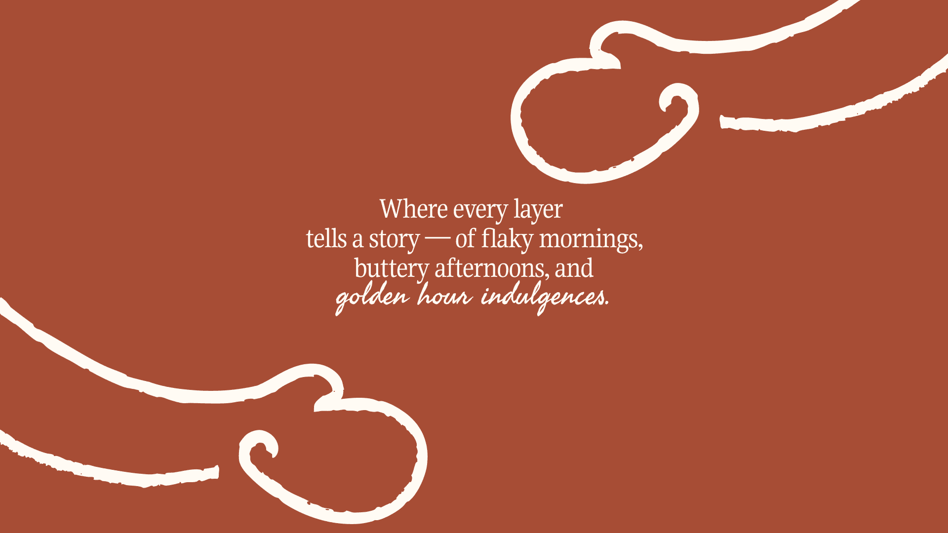
The core visual idea was the swirl, inspired by the croissant’s cross section.
The swirl worked because it referenced the product without illustration. It felt warm, layered, and repeatable. It could scale across packaging, interiors, and communication without losing meaning.
The form became the visual shorthand for the croissant category.
Visual Identity & Brand System
The design system was built to reinforce product recall across touchpoints.
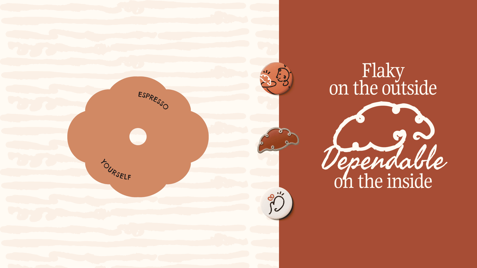
Logo System
A handcrafted typographic mark that feels familiar and confident. Acronym lockups and a Devanagari version support local intimacy.
Colour Palette
Butter Cream, Carbon, Raw Sienna, Burnt Orange. Colours drawn from the croissant itself and the warmth of baked goods.
Typography
Gupter for expression.
Manrope for clarity.
Freehand and Chelsea Market for character accents.
Character World
Illustrated neighbourhood regulars that reinforce repetition and return.
Patterns and Graphics
Layered, flaky motifs that echo the croissant making process.


Design in Application
The system was designed to surround the croissant consistently.
Applications included croissant sleeves, butter paper, menus, coffee cups, takeaway boxes, staff uniforms, coasters, signage, and social media.
Every touchpoint reinforced the same association.
One product. One focus. Repeated daily.

Outcome
House of Croissants launched as a brand with clear product ownership.
By anchoring the entire experience around a single item, Rare Ideas helped transform the croissant from a menu option into a category people could recall instinctively.

Featured On


Credits
Client
Studio
